Documentation and Examples
klib
Examples
Additional examples can be found on Medium / TowardsDataScience or in this YouTube video by Data Professor:

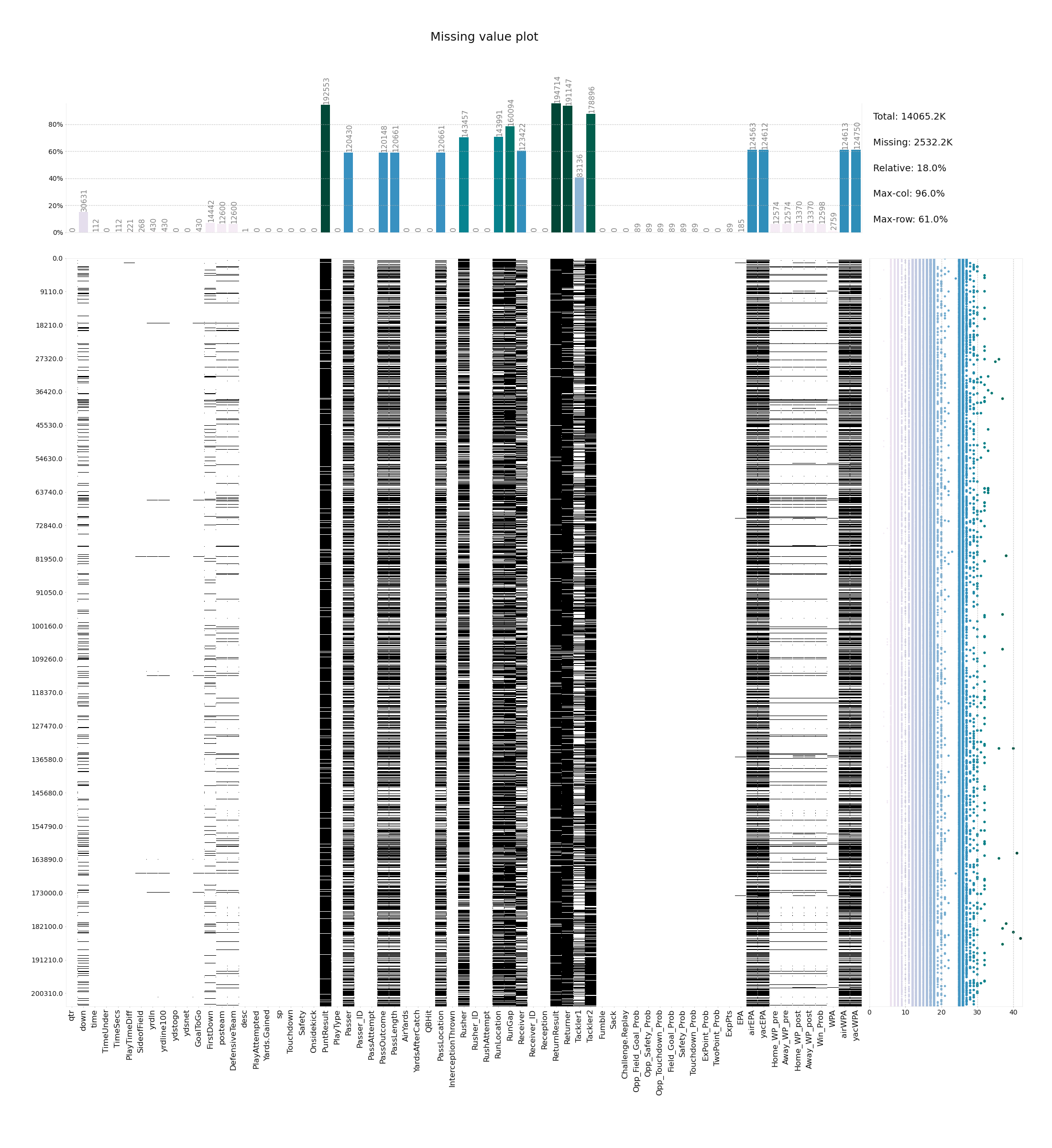
Missing Value Plot
This plot visualizes the missing values in a dataset. At the top it shows the aggregate for each column using a relative scale and absolute missing-value annotations, while on the right, summary statistics and individual row results are displayed. Using this plot allows to gain a quick overview over the structure of missing values and their relation in a dataset and easily determine which columns and rows to investigate / drop.
klib.missingval_plot(df) # default representation of missing values, other settings such as sorting are available
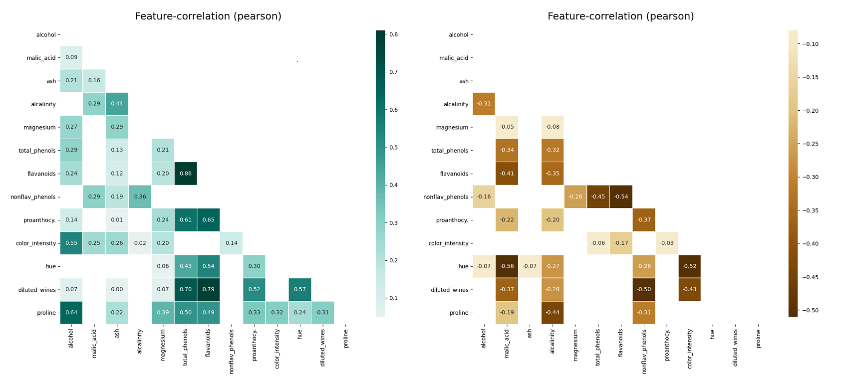
Correlation Plots
This plot visualizes the correlation between different features. Settings include the possibility to only display positive, negative, high or low correlations as well as specify an additional threshold. This works for Person, Spearman and Kendall correlation. Annotations and development settings can optionally be turned on or off.
klib.corr_plot(df, split='pos') # displaying only positive correlations, other settings include threshold, cmap...
klib.corr_plot(df, split='neg') # displaying only negative correlations
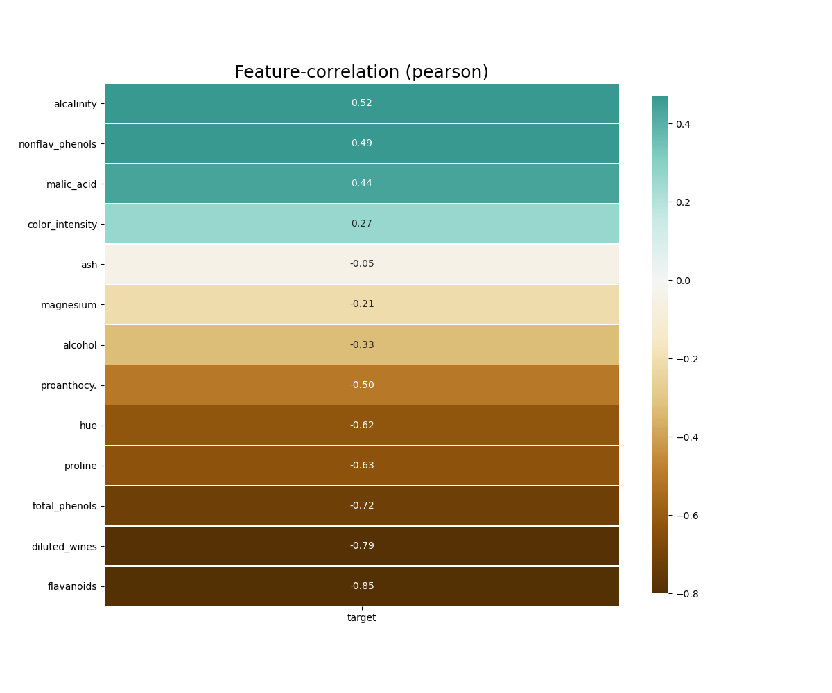
Further, as seen below, if a column is specified, either by name or by passing in a separate target List or pd.Series, the plot gives the correlation of all features with the specified target.
klib.corr_plot(df, target='wine') # default representation of correlations with the feature column
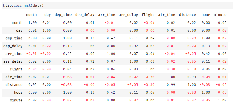
klib.corr_mat(df) # default representation of a correlation matrix
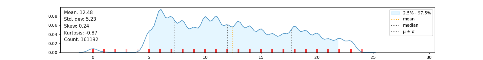
Numerical Data Distribution Plot
klib.dist_plot(df) # default representation of a distribution plot, other settings include fill_range, histogram, ...
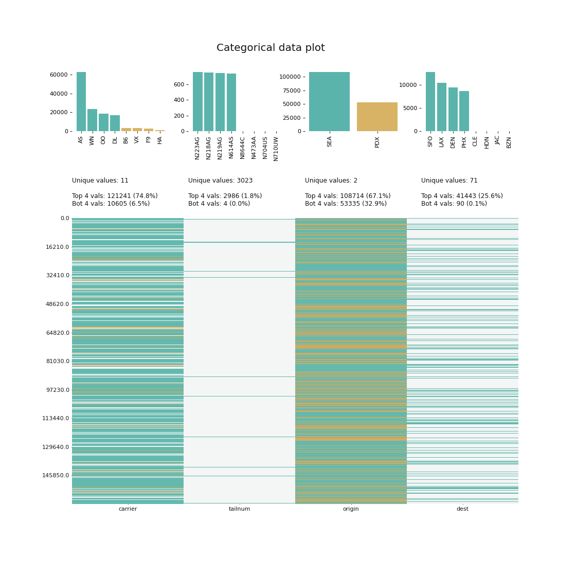
Categorical Data Plot
This section shows an example of categorical data visualization. The function allows to display the top and/or bottom values regarding their frequency in each column. Further, it gives an idea of the distribution of the values in the dataset. This plot comes in very handy during data analysis when considering changing datatypes to “category” or when planning to combine less frequent values into a seperate category before applying one-hot-encoding or similar functions.
klib.cat_plot(data, top=4, bottom=4) # representation of the 4 most & least common values in each categorical column
Data Cleaning and Aggregation
This sections describes the data cleaning and aggregation capabilities of klib. The functions have been shown to yield great results, even with dataframes as large as 20GB, drastically reducing the size and dimensions and therefore speeding up further calculations or reducing the time to save and load the data.
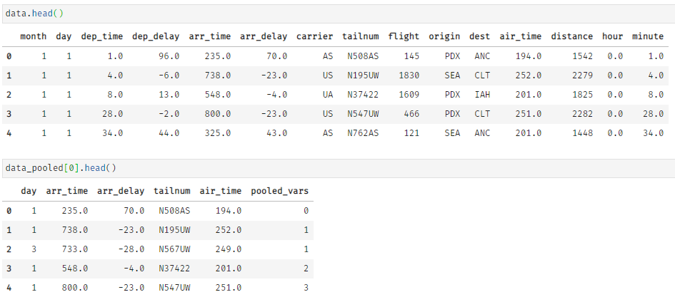
For demonstration purposes, we apply the function to a dataset about US flight data, which has an initial size of about 51 MB.
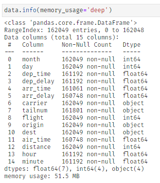
klib.data_cleaning()
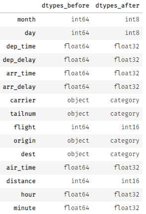
By applying klib.data_cleaning() the size reduces by about 44 MB (-85.2%). This is achieved by dropping empty and single valued columns as well as empty and duplicate rows (neither found in this example). Additionally, the optimal data types are inferred and applied, which also increases memory efficiency. This kind of reduction is not uncommon. For larger datasets the reduction in size often surpasses 90%.
klib.pool_duplicate_subsets()
Further, klib.pool_duplicate_subsets() can be applied, what ultimately reduces the dataset to only 3.8 MB (from 51 MB originally). This is a reduction of roughly -92.5%.
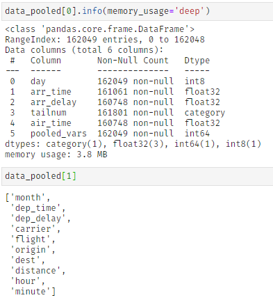
This function “pools” columns together based on several settings. Specifically, the pooling is achieved by finding duplicates in subsets of the data and encoding the largest possible subset with sufficient duplicates with integers. These are then added to the original data what allows dropping the previously identified and now encoded columns. While the encoding itself does not lead to a loss in information, some details might get lost in the aggregation step. While this is unlikely, it is advised to specifically exclude features that provide sufficient informational content by themselves as well as the target column by using the “exclude” setting.
As can be seen in *cat_plot()* the “carrier” column is made up of a few very frequent values - the top 4 values account for roughly 75% - while in “tailnum” the top 4 values barely make up 2%. This allows us to pool and encode “carrier” and similar columns, while “tailnum” remains in the dataset. Using this procedure, 56006 duplicate rows are identified in the subset, i.e., 56006 rows in 10 columns are encoded into a single column of dtype integer, greatly reducing the memory footprint and number of columns which should speed up model training.
All of these functions were run with their relatively “soft” default settings. Many parameters are available allowing a more restrictive data cleaning where needed.
Furthermore, the function klib.mv_col_handling() provides a sophisticated selection mechanism for columns with relatively many missing values. Instead of simply dropping these columns, they are converted into binary features (i.e. empty or not) checked for correlations among each other and with other features and in a second step for correlations with the label before a decision on ommitting them is made.